


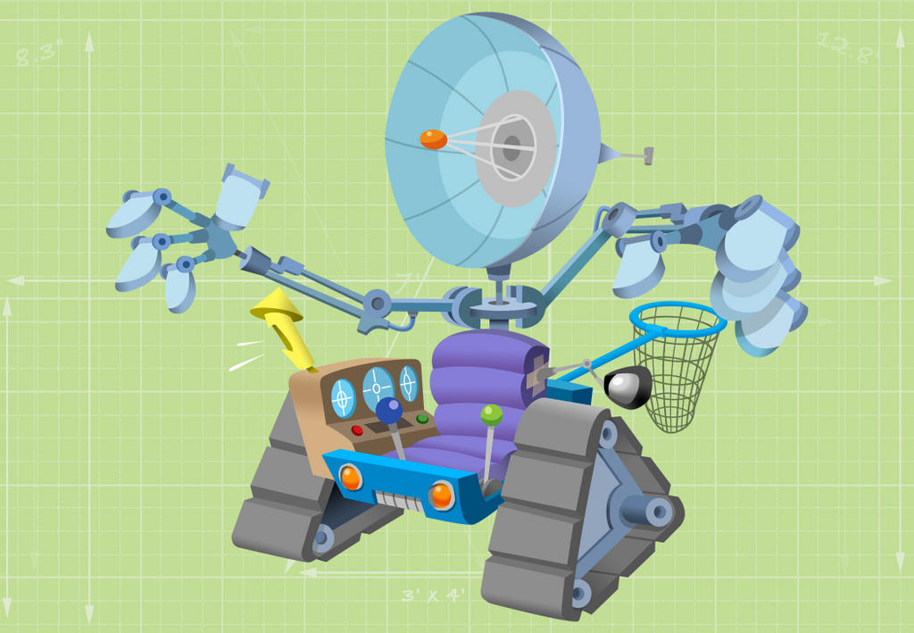
Here are some of the contraptions I designed for the COOKIE CRISP commercials at Uli Meyer Animation. In each commercial Chip the wolf comes up with a different invention to grab the Cookie Crisp cereal. The bottom 'bath-boat' is the CG version of my design. It was built by computer whizz-kid Leo Sanchez. It's almost impossible to tell the difference between the two isn't it?
11 comments:
Shall i post it?
Who's coming to the pub?
show it to us!
I mean the Caricature, Great job Leo! and Matt of course.
Leo, I'm already there!
Haven't you boys got a chat room to go to?
Move over and let an ordinary punter leave a comment will you!
Matt, I like the colour choices you made on these machines. How many colour versions before your final? Or did you just come straight out with it?
Michael
Having never had any in-depth training regarding colour theory I've always winged it! Over the years I've started to learn what works & doesn't work. What's original & what's old hat. In the end it's all a subjective aesthetic and I try to achieve a look that I personally find exciting/appealing. A lot of the time I have great trouble with colour, I put the colurs down & if they don't work first time then I really struggle to get it looking right. With the COOKIE CRISP prop designs we'd already set up a colour scheme for the COOKIE 'world' so it was just finding something that fitted in! I instinctively made the robot hands a dull metallic grey to start with but we jazzed it up a bit & gave it a blue hue which fitted the 'cartoony' feel of the ads a bit better. Footnote: All the COOKIE CRISP ads have green skies. This came out of the desperate struggle to show the ad agency something 'different' during the initial pitch stage. It's hardly original but does lend the spots a 'look' all of their own.
We've recently finished a new one which should be up on Uli's studio site soon.
Thanks Matt!
About the only formal training I got in art school was from a print technician (certainly not any of the tutors), and the gem that he passed on to me, roll-up hanging from corner of mouth and easing his buttock to let out a fart was:
"If it loos right, it is right".
Had he told me that in my first term, I could have saved myself 3 years of academic training!
Anyhoo, the effort you put in to your colour choices always seems to hit the button IMO.
Thanks again for taking the trouble to give such a full reply.
Whoops. That should read: "looks right", not "loos right"!
At the top I've added a version with a more three dimensional render pass by Leo Sanchez
That bath tub boat thingie looks a lot like an old Ninja Turtles toy I have that you can . . .get this . . play with in the tub.
Post a Comment